The border-image property in CSS is a bit tricky to wrap your mind around at first. In this article, we’ll discuss what the border-image property is, how to use it and its idiosyncrasies when it comes to using it in different browsers.
At this point in our CSS education, we ought to know what the border property is. To refresh, it’s a property that uses shorthand to specify a border around an element. It has the following structure:
border:
2px 								/*width*/
dashed 								/*style*/
green;								/*color*/
Just like the border, the border-image property is a shorthand property that uses a source image to construct a border around an element. It has the following structure:
border-image:
url("https://www.placekitten.com/501/700") 	/*source*/
25% / 										/*slice*/
70px / 										/*width*/
2px 										/*outset*/
stretch; /*repeat*/- border-image-source:
border-image-source is the longhand property for the source portion of the border-image property in CSS. It takes either a url that has a relative path or image url to an actual image, or is some sort of gradient
- border-image-slice:
border-image-slice property is the longhand property name for the slice portion of the border-image property. It divides the image into nine distinct sections.
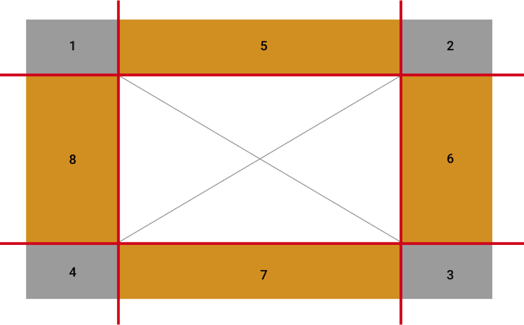
By default, the middle is taken out so the rest of the image can surround the element you are using the property on. The border-image-slice property can use up to four numbers (in %) to dictate where the slices will be. You can also use the word fill if you would like to use that middle section.
- border-image-width:
Just like the border-width property, the border-image-width property indicates how wide you would like your border-image. It can use percentages or rems/ems/px and take up to four numbers so that each side of the border can have its own width.
- border-image-outset:
The border-image-outset property sets how far the image border is from the element’s border box. As a reminder, the border box is part of the box model – that area between the padding and the margin. The higher the number, the further away it is from its border box. It takes up to four values so that each side has its own value if needed.
- border-image-repeat:
The border-image-repeat property sets how each edge will behave (the edge is each side not including the corners of the image). It takes up to two values. When one value is specified, it applies to all edges and when two values are specified, the first applies to the top and bottom, while the second applies to the left and right. The value can be stretch, repeat, round or space.
Browser Quirks
Firefox and Safari are the most common browsers that will allow you to use each individual property on its own to create a border-image. In Chrome, you can only use the shorthand property – and you have to use it in conjunction with the border-style property that will tell us the top of the border we would like to have (solid, dashed, etc). Be sure to take a look at this if you are using Chrome and it’s not working properly for you.
<!DOCTYPE html>
<html lang="en">
   <head>
       <meta charset="UTF-8" />
       <meta name="viewport" content="width=device-width, initial-scale=1.0" />
       <title>Border Image</title>
       <style>
           * {
               box-sizing: border-box;
           }

           .flex {
               display: flex;
               align-items: center;
               justify-content: center;
               text-align: center;
               width: 500px;
               height: 300px;
               margin: 20px;
           }
           .border-image-box {
               /* Below only works in Firefox and Safari*/
               border-image-source: url(http://placekitten.com/900/1000);
               border-image-slice: 25%;
               border-image-width: 70px;
               border-image-outset: 2px;
               border-image-repeat: round;
               padding: 80px;
               /* This way will NOT work in Chrome */
           }
           .border-image-shorthand {
               border-style: solid;
               border-image:
                   url(http://placekitten.com/900/1000)
                   25% /
                   70px /
                   2px
                   round;
               padding: 80px;
/* Above  works in all browsers. Firefox and Safari you can use the border-image prop without using the border-style property. In Chrome you MUST use the border-style prop in order for the image to show up on the webpage */


           }
       </style>
   </head>
   <body>
       <div class="border-image-box flex">
           This is a box. It's using each of the individual border-image
           properties to style
       </div>
       <div class="border-image-shorthand flex">
           This is a box. It's using the border-image shorthand to style
       </div>
   </body>
</html>
In this tutorial, we learned how to use the border-image property to create a CSS image border around an element. It’s a shorthand property that consists of border-image-source, border-image-slice, border-image-width, border-image-outset and border-image-repeat. To make this compatible with all browsers, set a border-style to solid before you specify the border-image values.
About us: Career Karma is a platform designed to help job seekers find, research, and connect with job training programs to advance their careers. Learn about the CK publication.
