Let’s go ahead and create some fun CSS shapes! Follow my Codepen for all the code. Let’s do this.
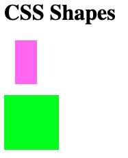
Rectangles and Squares
All our shapes will be wrapped in a div. The most basic shape is the square and the rectangle since by default the div is a square or rectangle depending on the width and height properties. So the square has equal width and height whereas rectangle doesn’t:
.rectangle {
  width: 2rem;
  height: 4rem;
  background-color: violet;
}

.square {
  width: 5rem;
  height: 5rem;
  background-color: lime;
}
Reminder: We use rem which is based on the root font-size and allows for easy scale. This is default on the browser (usually 16px). We set our font-size to 20px, so 2rem is 40px.
Circle
We’ll go ahead and create a circle for a profile image. To create a circle is similar to the square but we need to specify the border-radius. To round the corners, it will have to be at 50%. If we want an oval we’ll modify the width/height in a similar vein as the rectangle.
Let’s make our profile image:
.profile-image {
  width: 100px;
  height: 100px;
  border-radius: 50%;
  background-image: url("https://user-images.githubusercontent.com/15071636/91342237-57ad9a00-e7a0-11ea-97bc-606a5998b29a.jpg");
  background-position: center center;
  background-size: cover;
}
Note: The background properties are to get the image, size it, and center it.

Parallelogram
We can also make a parallelogram. This shape can be useful when adding a cool text effect. Here we’ll use the transform property and we’ll use the skew value to transform the shape (and anything inside) as a parallelogram with either 20 or -20 degrees.
.parallelogram {
  color: ivory;
  width: 6rem;
  height: 1.5rem;
  transform: skew(-20deg);
  background: indianred;
}

Looks cool right 😎
Other Shapes
Now that we have some knowledge of CSS shapes and its uses, we can take a look at other shapes. All of them you can play for yourself on my Codepen.
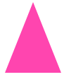
.triangle {
  width: 0;
  height: 0;
  border-left: 2rem solid transparent;
  border-right: 2rem solid transparent;
  border-bottom: 5rem solid hotpink;
}
While there are many ways to do a heart, and you can find many iterations of it online, this one is pretty straightforward.
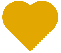
.heart {
  width: 10rem;
  background: radial-gradient(circle at 60% 65%, goldenrod 64%, transparent 65%)
      top left, radial-gradient(
        circle at 40% 65%,
        goldenrod 64%,
        transparent 65%
      ) top right,
    linear-gradient(to bottom left, goldenrod 43%, transparent 43%) bottom left,
    linear-gradient(to bottom right, goldenrod 43%, transparent 43%) bottom right;
  background-size: 50% 50%;
  background-repeat: no-repeat;
}

.heart::before {
  content: "";
  display: block;
  padding-top: 100%;
}
Go ahead and play with the percentages and change the colors. You can see how the heart is being built. So we can see how with the ::before and also ::after pseudo-elements we can make some cool shapes.
Also, with the polygon() function we can specify other shapes, expanding our limits.

.letter-t {
  width: 5rem;
  height: 5rem;
  margin: 0 1rem;
  shape-outside: polygon(
    0 0,
    100% 0,
    100% 20%,
    60% 20%,
    60% 100%,
    40% 100%,
    40% 20%,
    0 20%
  );
  clip-path: polygon(
    0 0,
    100% 0,
    100% 20%,
    60% 20%,
    60% 100%,
    40% 80%,
    40% 20%,
    10% 20%
  );
  background: navajowhite;
}
Do check this clip-path maker, a cool tool that will generate for you the code for a bunch of shapes!
About us: Career Karma is a platform designed to help job seekers find, research, and connect with job training programs to advance their careers. Learn about the CK publication.
